
This is not the first time I try to get this done correctly, hopefully it will be the last.
I do not like the indirect control of matplotlib’s imshow, so I resorted to using pcolormesh (similar for the slower pcolor). However, displaying the ticks in correct positions for a given dataset is not fully trivial, since pcolormesh interprets x and y data as boundaries for the plotted color cells. Thus the below.
import pylab as pl
import numpy as np
# values x and y give values at z
xmin = 1; xmax = 4; dx = 1
ymin = 1; ymax = 3; dy = .5
x,y = np.meshgrid(np.arange(xmin,xmax,dx),np.arange(ymin,ymax,dy))
z = x*y
# transform x and y to boundaries of x and y
x2,y2 = np.meshgrid(np.arange(xmin,xmax+dx,dx)-dx/2.,np.arange(ymin,ymax+dy,dy)-dy/2.)
# pcolormesh without x and y just uses indexing as labels
pl.subplot(121)
pl.pcolormesh(z)
pl.title("Wrong ticks")
# pcolormesh with x and y values gives a wrong plot, x and y are treated as boundaries
pl.subplot(122)
pl.title("Wrong: x,y as values")
pl.pcolormesh(x,y,z)
pl.figure()
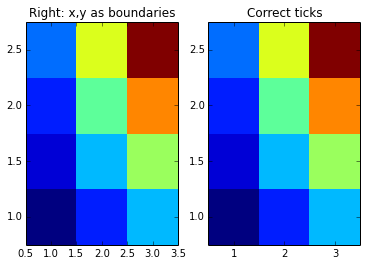
# using the boundaries gives correct plot
pl.subplot(121)
pl.title("Right: x,y as boundaries")
pl.pcolormesh(x2,y2,z)
pl.axis([x2.min(),x2.max(),y2.min(),y2.max()])
# using the boundaries gives correct plot
pl.subplot(122)
pl.title("Correct ticks")
pl.pcolormesh(x2,y2,z)
pl.axis([x2.min(),x2.max(),y2.min(),y2.max()])
pl.xticks(np.arange(xmin,xmax,dx))
pl.yticks(np.arange(ymin,ymax,dy))
pl.show()

Leave a Reply